Website Archive
I love making Web sites and to date I have made 75 public facing sites.
Here are some of my favourites.
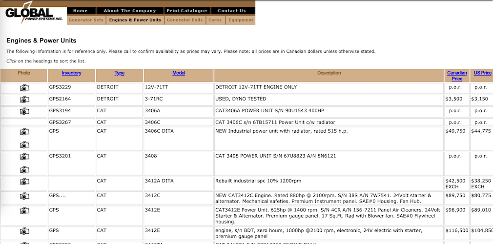
Global Power Systems, 2007
The owner of a small diesel engine repair company needed a website to advertise his
business. The solution I provided was a database backed inventory system. The public
website included an inventory for sale, complete with photos of the items.
The site included a custom flash animation introduction.
To accomodate off-line reference, the site included a print friendly catalogue.
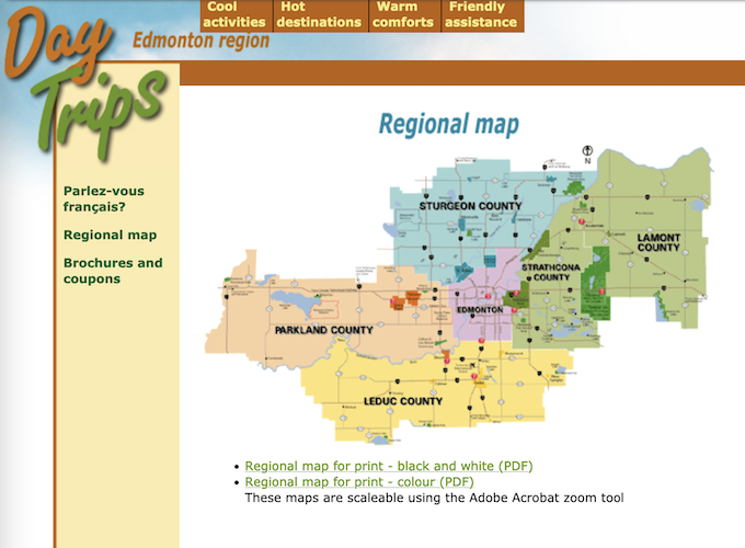
Edmonton Day Trips, 2005
Edmonton Day Trips needed an online solution for sharing their content. The main
challenge was to organize the information in multiple systems. I designed an
HTML site that included a regional map based system for those searching geographically
.
For people searching by interest, the main top navigation menu was organized by
activity.
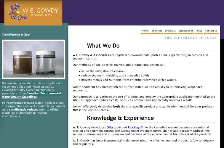
W.E. Gowdy & Associations, 2013
W.E. Gowdy & Associates needed a portfolio focused website. I designed a professional HTML based site that was one of my
'responsive' sites.
The unique color block design was replicated on the business cards
I designed. Given the unique services, the business provided, SEO was a big focus of
my work both when planning the site architecture
and when adding the business content.
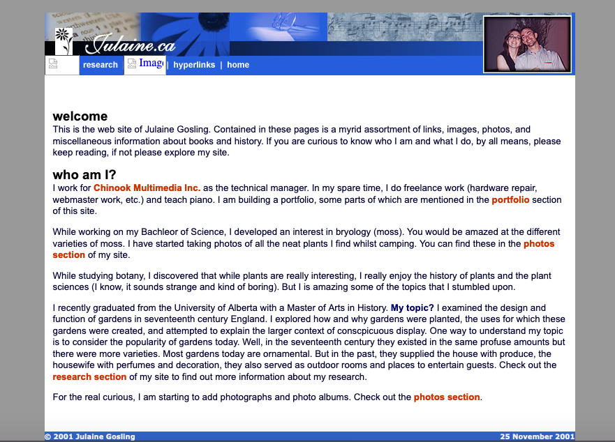
My Personal Site, 2001
My personal site has undergone many revisions since this intital design.
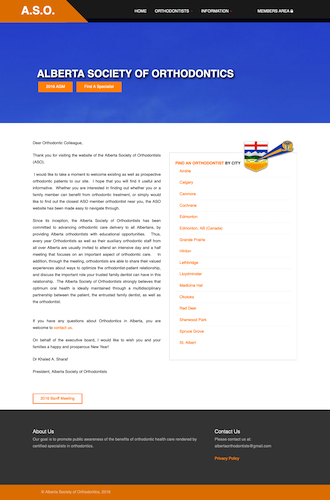
Alberta Society of Orthodontists, 2016
The website for the society needed to solve two needs: the public needed to find orthodontists, and the members needed the ability to pay dues and register for their annual conference. The Find a Specialist tool used a custom Google Maps integration along with a database backend to display a list of specialists, searchable geographically.
Clean layout, generous white space, and overall attention to detail were key components of the interface.

Snags Truck Parts, 2018
A part shop for heavy-duty trucks needed a promotional website. Bright colours, large buttons, and large fonts were chosen to assist the target audience using the site.
Based on an earlier design, this version of the design was responsive and intented to display better on mobile devices.
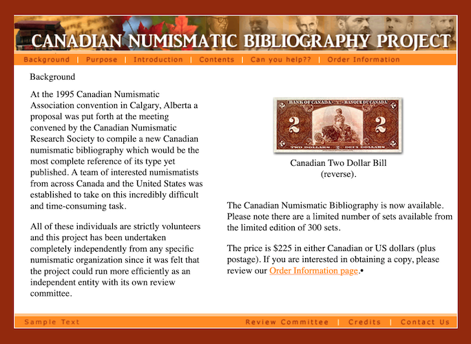
Canadian Numismatic Bibliography Project, 2002
The orange colour of the site was chosen to compliment the colour tones of the paper money. The site was built to advertise the Ultimate Book for the Collector of Canadian material.